The brief was essentially: "We're not into crystals. We like science." That kind of clarity is a gift. When a client knows exactly what they're not, the creative direction almost writes itself — the job is to make sure the visual system is as confident as the philosophy behind it.
—
Key Impact
Full Identity System • Logo + Wordmark • Environmental Application • Print + Packaging • Merchandise + Retail
The Unique Challenge
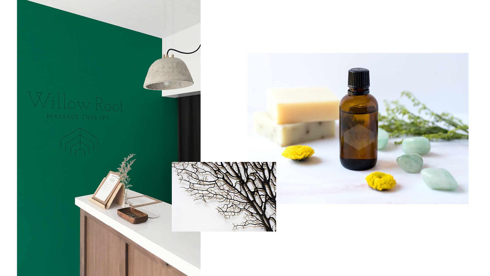
• A new massage therapy practice opening its first storefront needed an identity that clearly positioned it against the category conventions of massage branding — soft, mystical, and visually interchangeable
• Willow Root's founding philosophy — science-based massage therapy with zero "crystal shit" — required a brand that communicated clinical credibility and professional expertise without feeling cold or sterile
• The identity needed to work across a full retail and environmental context from day one: signage, print materials, products, merchandise, and the physical space itself
• Required a brand name rationale and visual system that held the tension between the practice's two defining values without defaulting to either end of the spectrum
The Strategic Solution
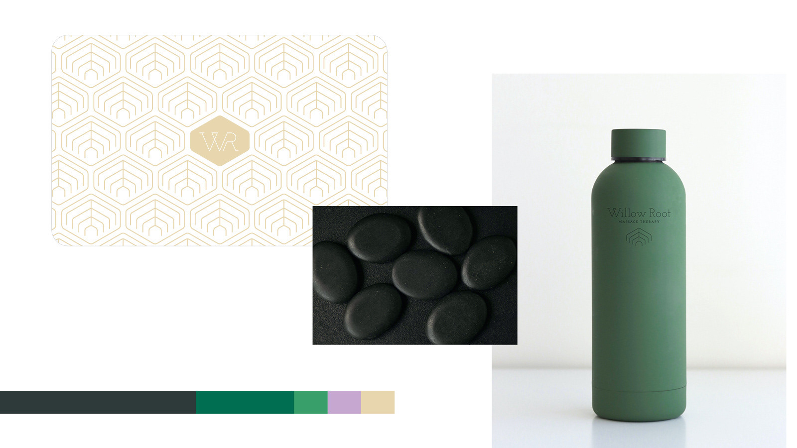
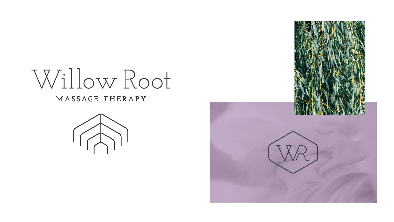
• Developed a brand identity rooted in the strategic tension at the heart of the practice — scientific rigor and a genuine respect for nature — which evokes both organic growth and grounded, structural strength
• Designed a clean, minimal wordmark paired with a bespoke icon — a refined geometric structure suggesting both the branching form of a willow and its roots
• Built a restrained color palette and typographic system that communicates calm authority sophisticated enough for a medical context, warm enough for a wellness environment
• Directed photography and spatial styling to reinforce the brand's visual language — natural materials, precise composition, muted organic tones — creating a cohesive in-store experience that extended the identity beyond print

Key Leadership Competencies
• Brand strategy and positioning developing a visual identity rooted in a clear philosophical tension and resolving it into a cohesive, distinctive creative direction
• Identity design creating a mark system with the restraint and precision required to work across a variety of contexts
• Environmental and spatial brand application extending identity into the physical space through signage, product design, and interior styling
• Category differentiation building a brand that deliberately rejects category conventions while remaining immediately legible to its target audience
• Client partnership translating a strong, opinionated founding vision into a brand system the client could confidently own and grow