The brief had one clear directive: no woo-woo. Bend Yoga wanted a practice that felt approachable, gender-neutral, and grounded in physical benefit — not crystals and chakras. When a client can tell you precisely what to avoid, the creative direction almost finds itself.
—
Key Impact
Full Identity System • Logo + Color System • Brand Standards • Print + Merchandise
The Unique Challenge
• A new yoga studio in South Bend, Indiana needed a brand identity that positioned the practice as approachable, gender-neutral, and grounded in physical benefit deliberately distancing itself from the "woo-woo" aesthetic that dominates the yoga category
• The studio's target audience included people who had been put off by conventional yoga branding — the Sanskrit, the crystals — requiring an identity that felt genuinely different without losing the inclusivity and community central to the studio experience
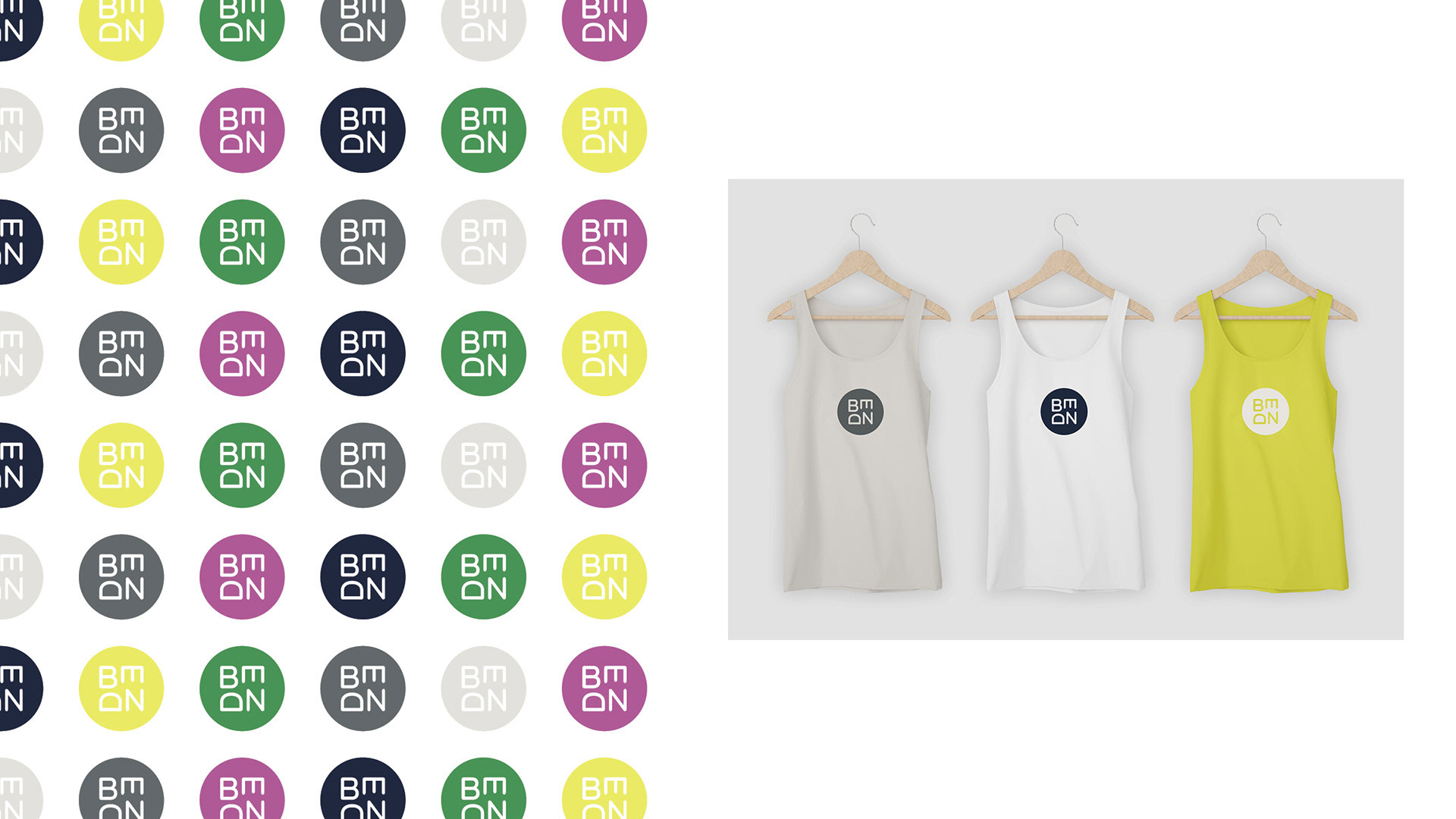
• Required a mark and brand system with the flexibility to work across apparel, print, signage, and digital including a color system expressive enough to give the brand energy and range without sacrificing the minimal, confident aesthetic
The Strategic Solution
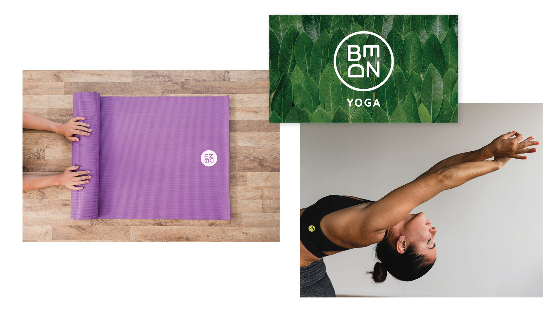
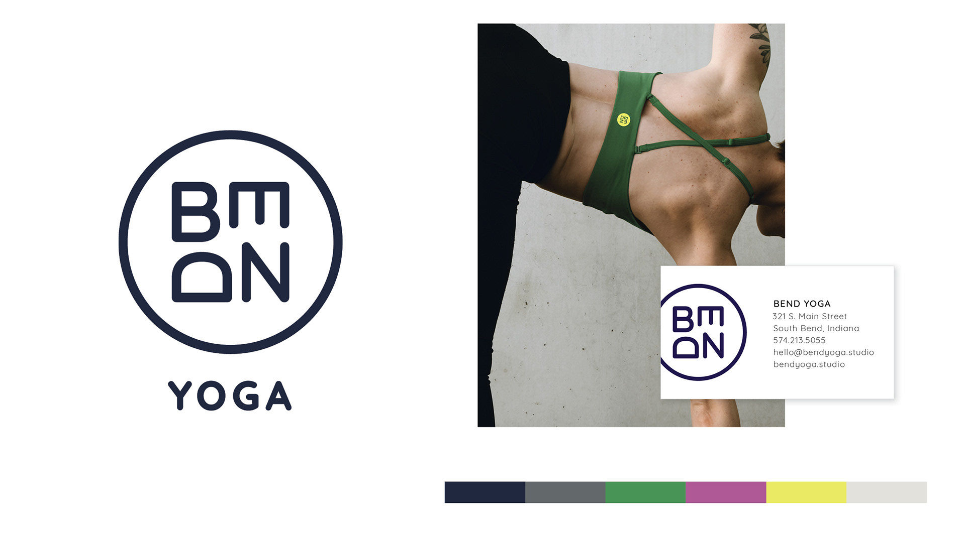
• Anchored the identity in a conceptual framework drawn from yoga philosophy itself: the circle as a symbol of sacred space and continuous movement, interpreted through a functional lens rather than a spiritual one
• Designed a bold, minimal monogram mark enclosed in a clean circle form, communicating the cyclical nature of practice without any literal or decorative yoga imagery
• Developed an expansive color system giving the brand range and expression across apparel and environmental applications demonstrating that a restrained mark could carry a vibrant, dynamic identity

Key Leadership Competencies
• Brand strategy and concept development grounding a visual identity in a clear philosophical rationale that resolves the client's core positioning challenge
• Category disruption designing a brand that deliberately rejects category conventions while remaining functional and ownable for its audience
• Identity system design creating a mark and color architecture with the flexibility to work across apparel, print, digital, and environmental applications
• Creative concept presentation developing and presenting multiple strategic directions, guiding the client toward the strongest long-term choice
• Brand standards development building the foundational system required for consistent brand execution over time